Mangen Research Associates, Inc.
Email us!
  • Home
  • Pricing and Forecasting
  • Product Design
  • ROI
  • Cultural Adjustments
  • Blog
  • About
  • Contact

Debt and Wealth in the USA

12/14/2017

0 Comments

 
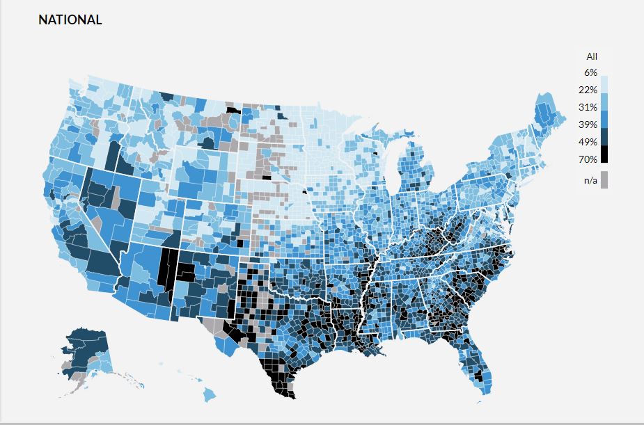
I just came across a very interesting chart developed by the researchers at the Urban Institute.  It uses data from the credit bureaus to create a county-level map of debt in the USA.  Here is a screen grab of the map for the country as a whole.  Lighter shaded areas indicate less debt, while those with darker shades of blue indicate higher levels of debt.
Picture
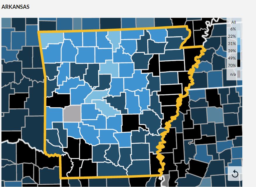
One of the neat aspects of this map is that it is interactive when viewed at the Urban Institute site at  ​https://apps.urban.org/features/debt-interactive-map/.  You can zoom in on different geographies to examine the results in greater detail.  Here I've zoomed in on Arkansas.
Picture
You can also click on any specific county, and get some comparative data on the the debt, income, and demographics for each county.  Check it out!
0 Comments

    David J. Mangen

    I'll use this space to make some occasional comments about statistics, numbers and research issues as seen in the world today.

    Archives

    October 2020
    July 2020
    April 2020
    December 2019
    September 2019
    February 2018
    January 2018
    December 2017
    January 2017
    December 2016
    November 2016
    March 2016
    January 2016
    October 2015
    July 2015
    March 2015
    January 2015
    November 2014
    September 2014
    July 2014
    June 2014
    May 2014
    January 2014

    Categories

    All
    Big Data

    RSS Feed

Welcome to the Mangen Research Associates, Inc. web site
Copyright 2015 Mangen Research Associates, Inc.