
Tomorrow morning have a piece of pie -- preferably at about 9:26 local time.
|
The other day I was doing some work in the early evening and I received a call from a group purporting to be an independent political polling firm, and they asked if I minded participating in their survey of the MN electorate. I was somewhat surprised because we just finished the silly season of political gamesmanship a couple of months ago, but OK, I agreed to participate in the poll.
Question 1: Are you a registered voter? OK, yes I am. Question 2: Do you consider yourself a Republican, Democrat, or Independent. Independent. I'd like to ask your opinion about some issues: Question 3: An agree-disagree flash-point ideological test issue for one of the political parties. In the interests of protecting the guilty I won't identify which party. Question 4: Second agree-disagree flash-point ideological test issue for the same political party. Question 5: My last question is... and we get the 3rd ideological test for the same party, Now I answered all of the questions with my opinions, and told the interviewer that their poll had zero validity simply because (a) questions 3-5 were leading and (b) a blind pig could figure out the political affiliation of the person or organization that was sponsoring the poll. I suspect that a certain state senator was the sponsor. Which gets me to the point of this blog post. The data from that little study will have no validity whatsoever as a gauge of measuring the interests of the citizenry. It might be able to get a decent percentage indicator of the "party faithful" in a given geographic area. But in terms of helping to understand the issues that are important to the public at this point in time, it is worthless. And no amount of analytics will help overcome the fact that the data are fundamentally garbage. The election in the USA is finally over, and the obnoxious political ads have stopped. The election was, on the whole, a fairly clear and dramatic victory for the Republican Party in the states. But is this election a mandate as some are claiming?
Regardless of the party that purports to have received one, the use of the word "mandate" in most political contexts is quite annoying to me. Why? Because rarely do the numbers to support that assertion. Let's look at and personalize the numbers for a fairly common electoral margin that would often produce the assertion of a mandate-- a 55% to 45% victory for one or the other of the parties. A 10 point victory is pretty dramatic, right? If we look at this in a more personalized context however, that 10 point margin of victory becomes a bit more shallow. With the holidays coming up, many of us will be having celebrations in our homes where we'll have 20 or so family members coming to visit. If we apply that 55% to 45% margin to the group of 20 family members, that translates into a split of 11 to 9. If one person changes their mind, the "mandate" has become a dead heat. Sorry, but that hardly reflects a mandate. What would I call a mandate? If you're getting into the range of 2-1 -- 67% to 33% -- then we can start to talk about a mandate. But please, do not use the Electoral College to claim your mandate. Over the past couple of decades, the response rates to surveys administered in the United States have plummeted. The American Association for Public Opinion Research has released "Current Knowledge and Considerations Regarding Survey Refusals," which is a pretty comprehensive report on what is currently known about refusals and the impact that they have on the validity of research. You can download the report here.
 As someone who crunches numbers for a living, you can believe me when I say that the growth in computing power provided by technological advances in the past 30 years is something that I appreciate -- really appreciate. It has made so much of my work easier, faster, and far more accurate. (But then I can remember when we used card sorters and programmable, mechanical calculators!)
But with this power we can also see some problems, and of late I am noticing a trend that gives me pause. Specifically, I see occasional requests to basically abuse data files by crunching all possible combinations of various data elements, with the results sorted by the degree of significance found in the relationship. With the many thousands (or even millions) of relationships that can be tested, the opportunity for spurious correlations jumps off the charts. Most people understand that this opportunity for false positive findings really does not do their research any good, and will try to get a bit more focused when pushed on the validity of doing research in this fashion. But others insist on going down this path. I will decline such business. To me, this seems to be an approach to research similar to how a drunk uses a lamp post -- for support as opposed to illumination. 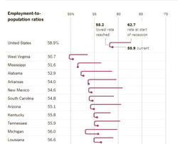 The Upshot section of the New York Times has an article in the 16 June 2014 edition that presents some very stark data about the tepid recovery of the US economy when viewed through the eyes of employment, as measured by Employment to Population ratios. For the nation as a whole, the rate dropped by 4.5 from the start of the recession to the lowest rate seen, and the rebound has recovered only 0.7 of the total decline.
http://www.nytimes.com/2014/06/17/upshot/measuring-recovery-count-the-employed-not-the-unemployed.html The full Upshot chart, only a part of which I have reproduced here, gives the data for every state in the Union. There are obviously some dramatic differences by state that reflect their unique economies. But even some of the comparatively well-off states (The Dakotas, Nebraska) have, by this index, relatively tepid recoveries. I also like this graphic. They've done an excellent job of combining multiple data elements into a compelling (at least to me) picture of the recovery. The Federal Reserve does a nice job of publishing a host of statistics about the financial system and the economy overall. Today's release focused on industrial production, which sowed a nice upward tick in May after a decline in April. However, the overall capacity utilization rate is still below the long-term (1972-2013) average, which is somewhat disappointing after this prolonged period of economic recovery.
For all of the details please see http://www.federalreserve.gov/releases/g17/Current/default.htm. Job growth data for the US economy came out today from the Labor Department, with over 200,000 jobs added in May. While nice and indicative of a continued recovery, the relatively high unemployment rate (6.3%) after 5 years of recovery is still rather poor.
I ran across this summary of the differences between some of the differences between the major statistics packages. Thank you to the DataCamp Blog. The news out of the Commerce Department today that US GDP declined by 1% in Q1 is not good news for the tepid recovery in the US economy. Personally I suspect that the increased income inequality that we see in this country has something to do with it. Remember that Henry Ford gave his employees raises so that they could afford to buy his products.
|
David J. MangenI'll use this space to make some occasional comments about statistics, numbers and research issues as seen in the world today. Archives
July 2021
Categories |

 RSS Feed