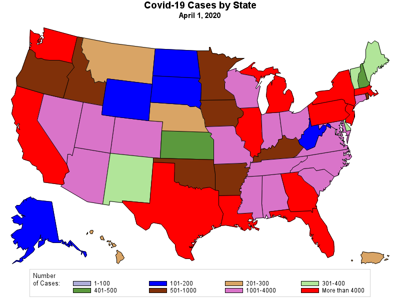
The growth of Covid-19 cases in the USA and around the world is truly startling. Here are some graphs some data to illustrate how pervasive the disease is in the US. The picture that it paints is not hopeful.
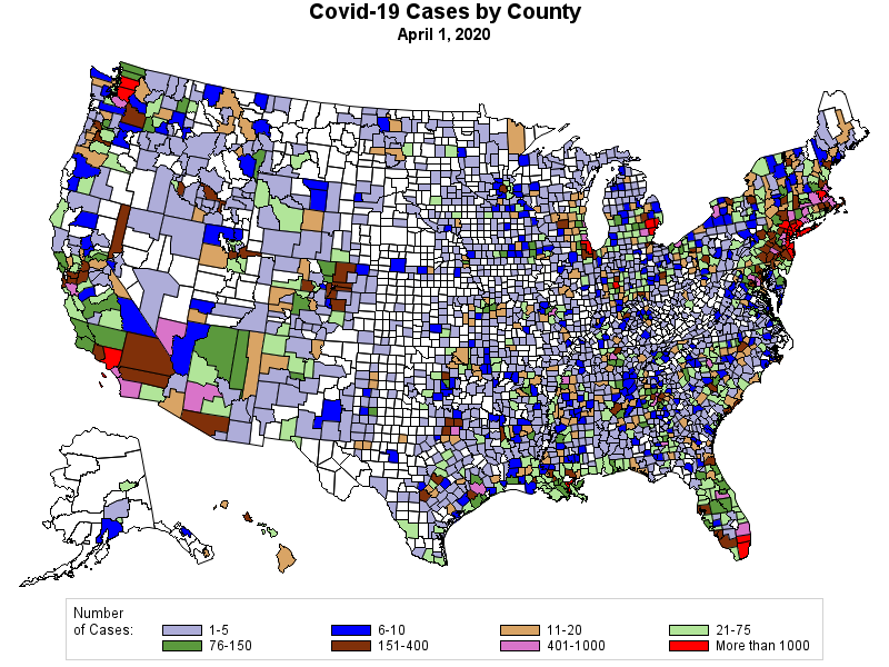
The same data, but presented for each county in the USA, illustrates how to date at least the spread has been concentrated in urban areas.
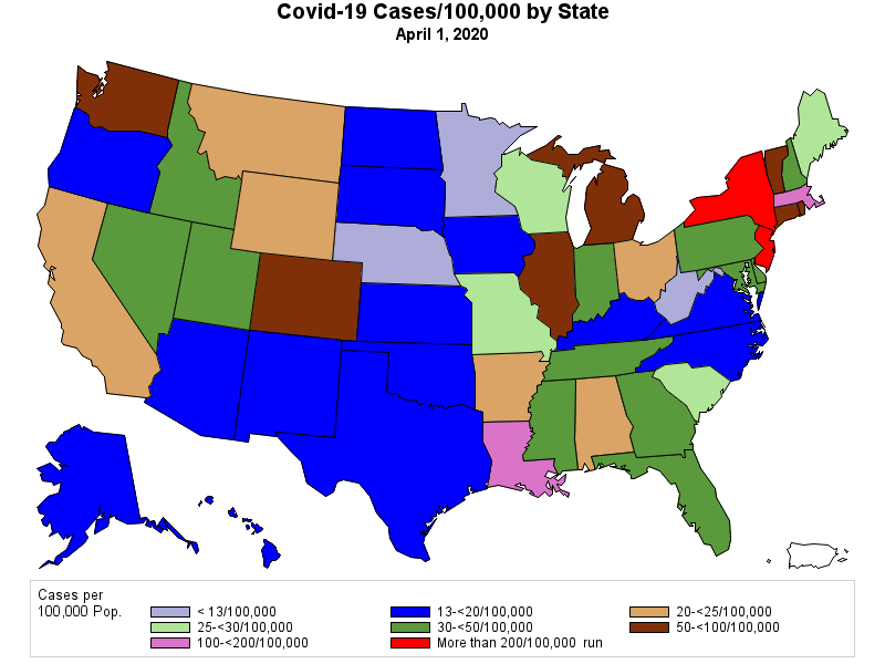
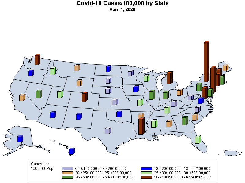
The sheer number of cases is, however, influenced by population. If we convert the number of cases into a per capita rate, the picture looks a bit different.
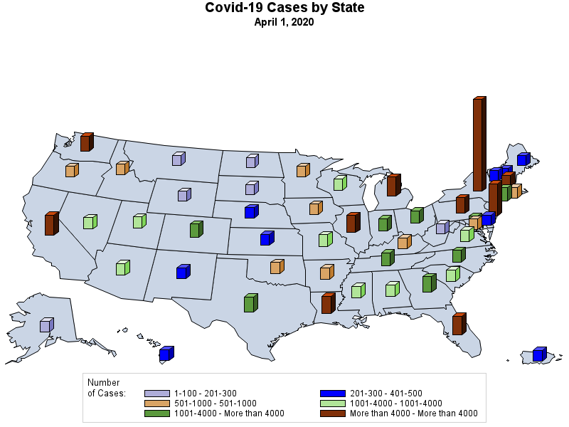
One problem with using the maps as presented above is that some of the nuances are lost by virtue of collapsing all of the data into 8 categories. The following two maps rectify that limitation to some degree. The situation in New York, New Jersey, and Louisiana is dire.
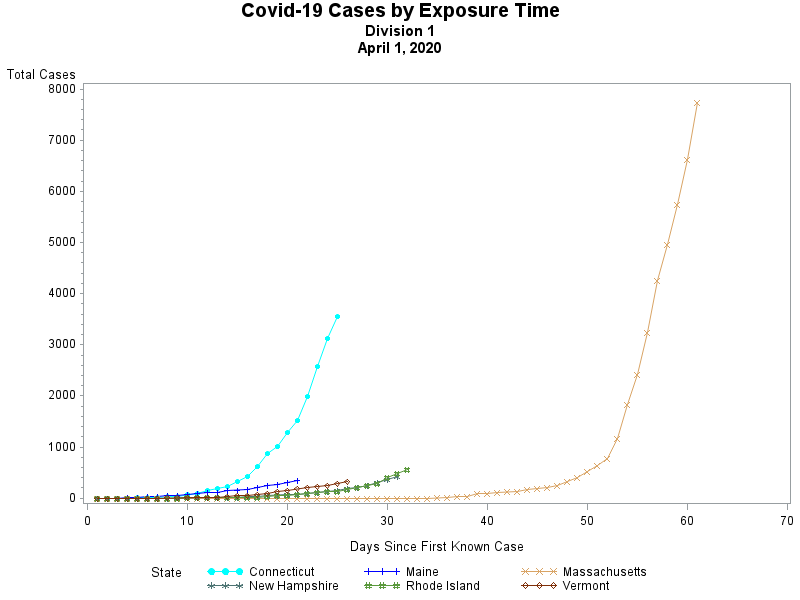
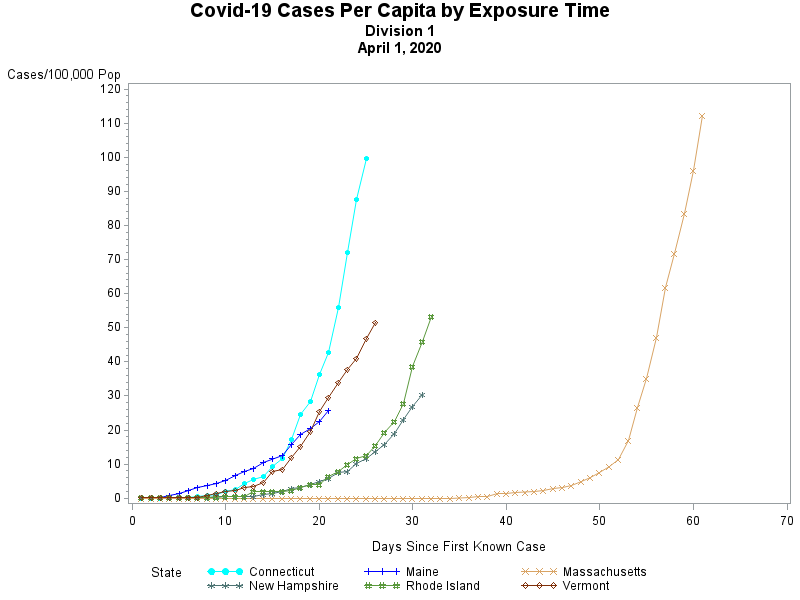
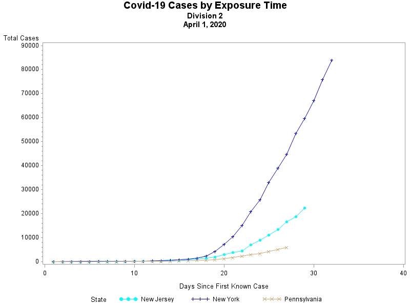
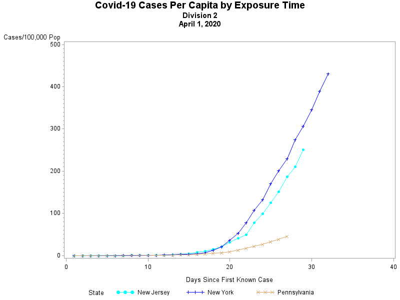
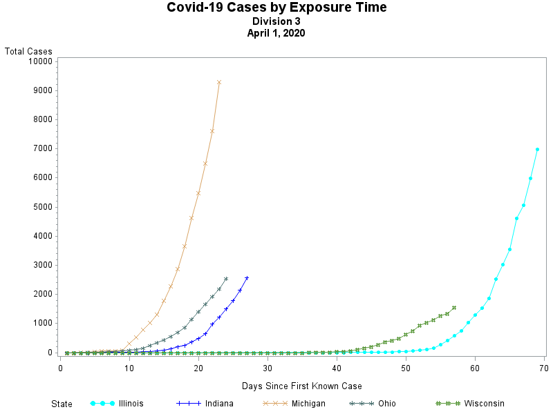
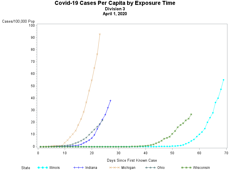
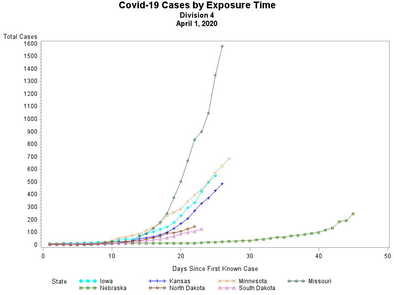
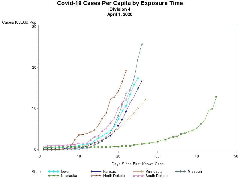
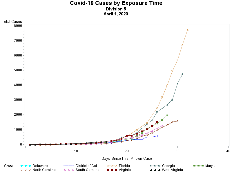
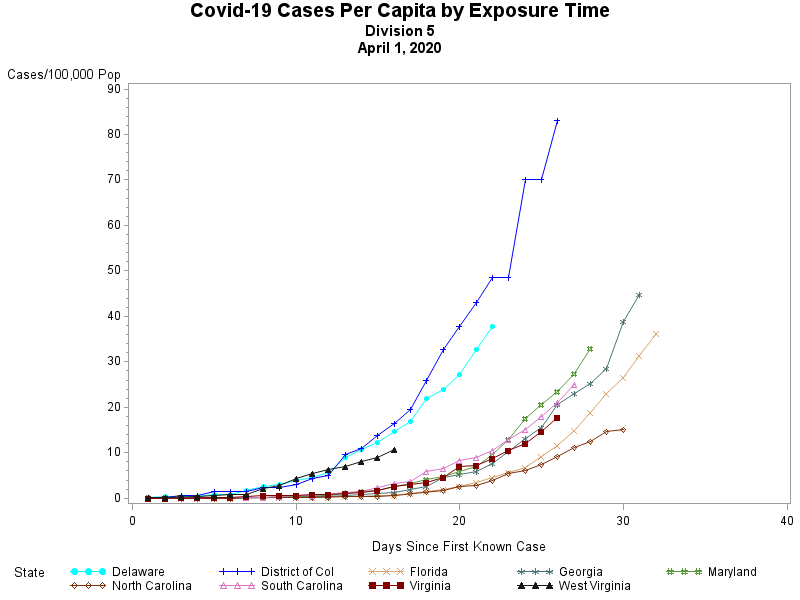
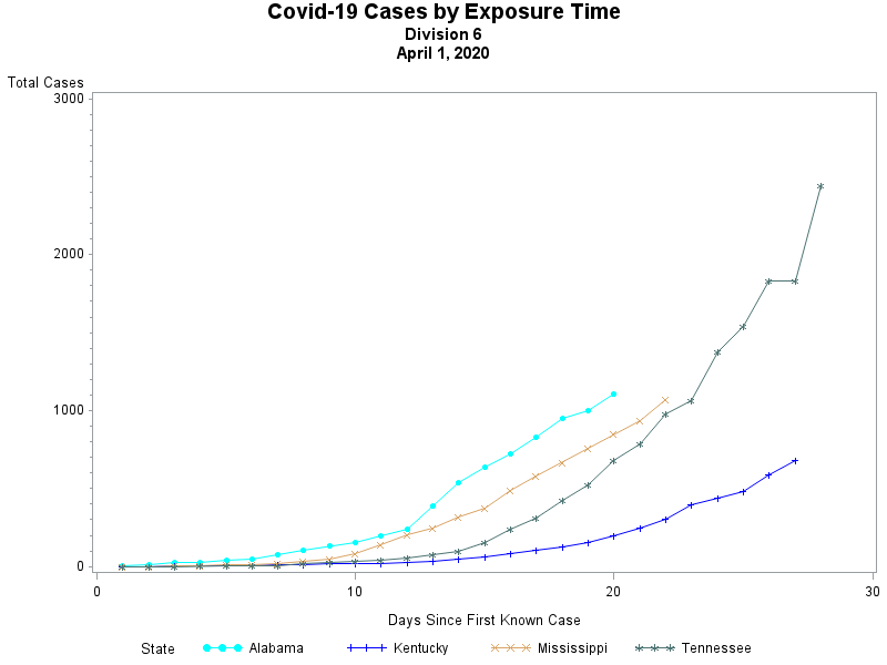
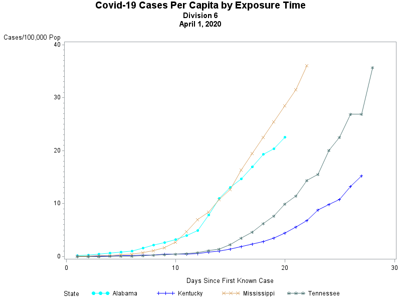
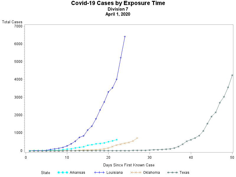
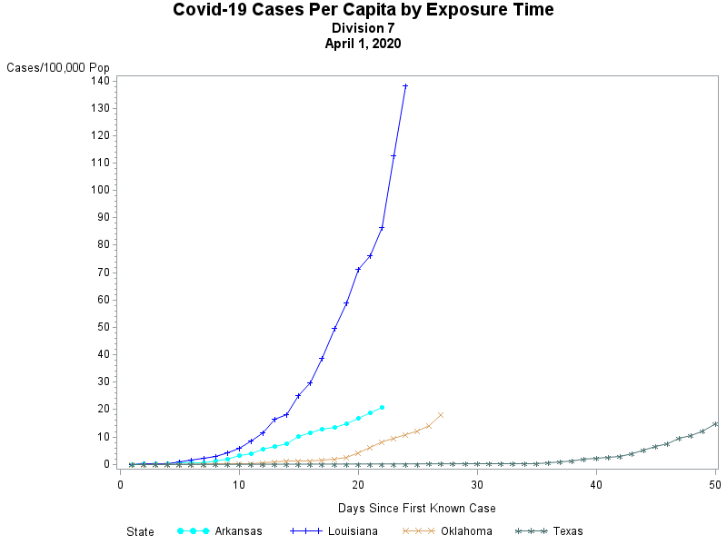
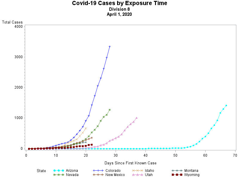
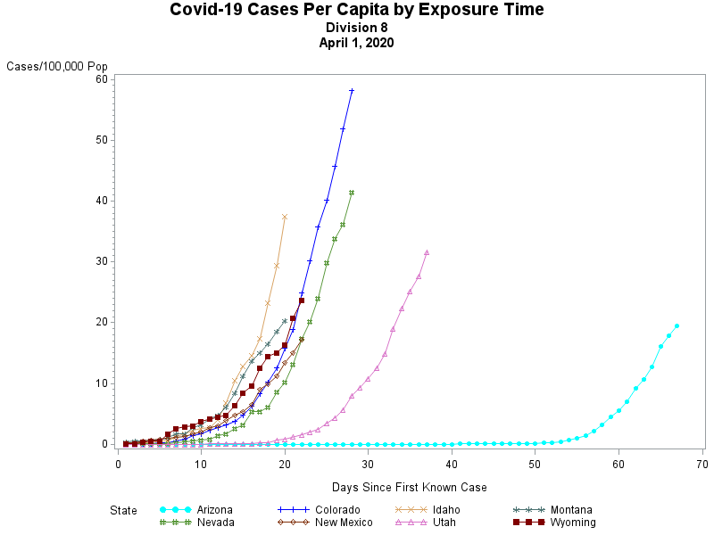
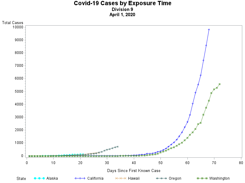
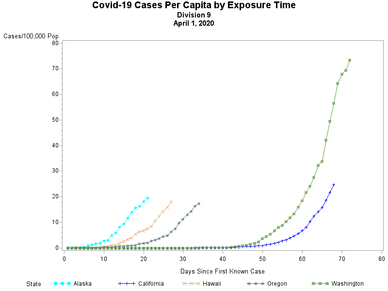
And despite the efforts of many to try and flatten the curve, at least so far the curves all seem to be accelerating -- not slowing. Here is the growth curves -- plotted against the date that the first case was observed -- for all 50 states grouped according to the Geographic division into which each state is placed.
While the growth rates are more serious in some states as compared to others, none of them appear to be close to tipping over and beginning to slow down.

 RSS Feed