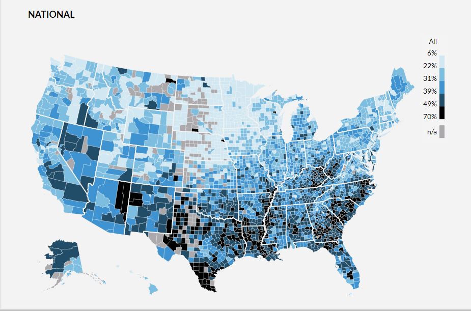
I just came across a very interesting chart developed by the researchers at the Urban Institute. It uses data from the credit bureaus to create a county-level map of debt in the USA. Here is a screen grab of the map for the country as a whole. Lighter shaded areas indicate less debt, while those with darker shades of blue indicate higher levels of debt.
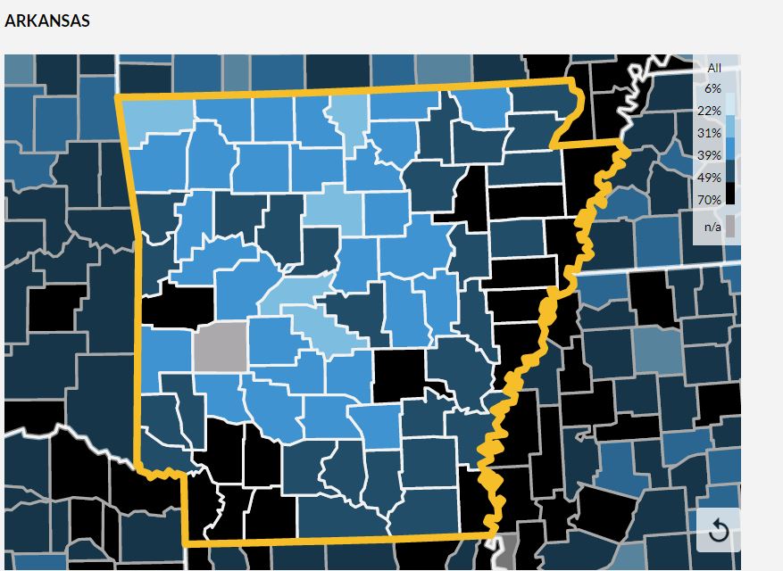
One of the neat aspects of this map is that it is interactive when viewed at the Urban Institute site at https://apps.urban.org/features/debt-interactive-map/. You can zoom in on different geographies to examine the results in greater detail. Here I've zoomed in on Arkansas.
You can also click on any specific county, and get some comparative data on the the debt, income, and demographics for each county. Check it out!


 RSS Feed