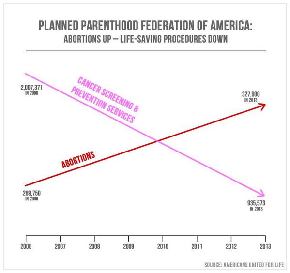
This gets my vote as one of the most distorted graphs of the year, and the Bubba who used it should be tossed out of office for either his fundamental ignorance or his crass willingness to distort the data while pursuing his political agenda.
|
Yes, it is very easy to lie with statistics, but it is perhaps even easier to lie with graphs. We recently saw a situation where an unscrupulous politician, intent on pandering to one of his interest groups, briefly displayed the following graph on the screen during a committee hearing on the funding of Planned Parenthood. The display on the screen was brief, and thus sought to communicate that abortions out-number cancer screening and prevention services. But wait -- look at the actual numbers in the graph (which to their credit they did include): When did 327,000 become greater than 935,573? Or, 935,573 approximately equal to 289,750? Or 2 million approximately equal to 327,000?
This gets my vote as one of the most distorted graphs of the year, and the Bubba who used it should be tossed out of office for either his fundamental ignorance or his crass willingness to distort the data while pursuing his political agenda.
3 Comments
Ed Framer
1/18/2016 06:20:30 pm
The graph doesn't even make sense. If someone wanted to make a graph as confusing as humanly possible, this is at least one of the graphs they could make.
Reply
David Mangen
1/19/2016 07:33:27 am
Ed I agree entirely -- this graph is an absolutely shameful presentation of data created -- I am certain -- with the goal of deception.
Reply
Leave a Reply. |
David J. MangenI'll use this space to make some occasional comments about statistics, numbers and research issues as seen in the world today. Archives
July 2021
Categories |


 RSS Feed