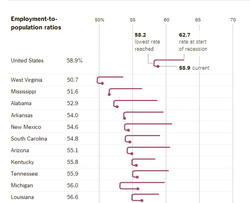
The Upshot section of the New York Times has an article in the 16 June 2014 edition that presents some very stark data about the tepid recovery of the US economy when viewed through the eyes of employment, as measured by Employment to Population ratios. For the nation as a whole, the rate dropped by 4.5 from the start of the recession to the lowest rate seen, and the rebound has recovered only 0.7 of the total decline.
http://www.nytimes.com/2014/06/17/upshot/measuring-recovery-count-the-employed-not-the-unemployed.html
The full Upshot chart, only a part of which I have reproduced here, gives the data for every state in the Union. There are obviously some dramatic differences by state that reflect their unique economies. But even some of the comparatively well-off states (The Dakotas, Nebraska) have, by this index, relatively tepid recoveries.
I also like this graphic. They've done an excellent job of combining multiple data elements into a compelling (at least to me) picture of the recovery.

 RSS Feed